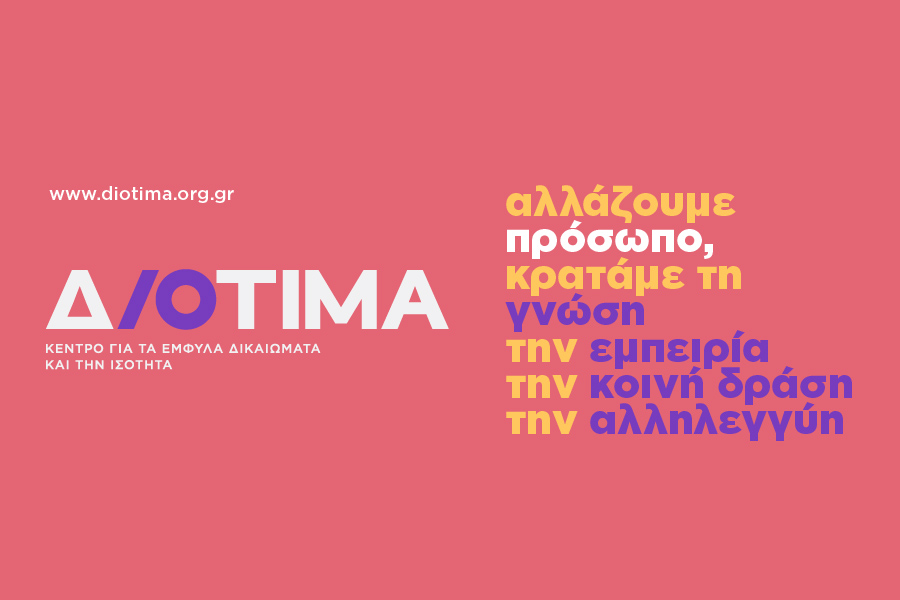
Looking to the future, the challenges and prospects of a world without gender-based violence and discrimination, we are happy to present to you our new visual identity.
Having traveled a rich journey of 32 years in the field of gender rights, we keep the knowledge, the experience, the common action, and the solidarity. We remain committed to feminist values, ideas, and practices.
Changing our distinctive title and visual identity closes a circle. Our transformation is symbolically sealed; our transition to a more inclusive and interdisciplinary approach to gender rights.
Our multifaceted work is more clearly reflected, which in recent years includes specialized support services for male and female survivors of gender-based violence, training, and research, advocacy and prevention actions, and awareness campaigns. A project that expands the founding goal of Diotima, which was the creation of the first center for women’s studies and research in our country, in 1989.
So, we change and continue with a vision of a world of gender equality and justice, and a mission to empower all persons who suffer violence and the multiple consequences of gender-based heteronormative patriarchy.
Thank you very much for your trust and support, all these years, and for your contribution to making our message heard louder.
The Susami Creative Agency that undertook the design of our new visual identity, briefly describes the rationale behind the complete redesign of our logo.
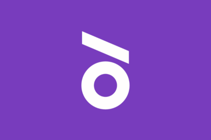
“The new logo of Diotima is characterized by geometric simplicity and abstract symbolism. The robust, geometric script receives the insertion of an italic I (iota), which, in combination with the circle of O (omicron) form the new mark of the organization, a symbol within the new logo, which, in its upright placement, forms a lowercase δ, the first letter in the name Diotima.
In the new symbol, the circle signifies concepts such as inclusion, protection, solidarity, teamwork, collectivity and support. The diagonal line symbolizes dynamism, energy and movement.
As a whole, the new symbol, placed between the austere writing of the logo, works intrusively, symbolizing the intersection, the paradigm shift attempted by Diotima, as well as the opposition to existing systems of gender oppression and inequality.”


